BRAND STYLE GUIDE: GADGE USA
The task was to construct a comprehensive Brand Style Guide for Gadge USA that meticulously defines and consolidates the brand's visual identity, ensuring coherence, consistency, and a reflection of the brand's essence across all platforms and touch points.
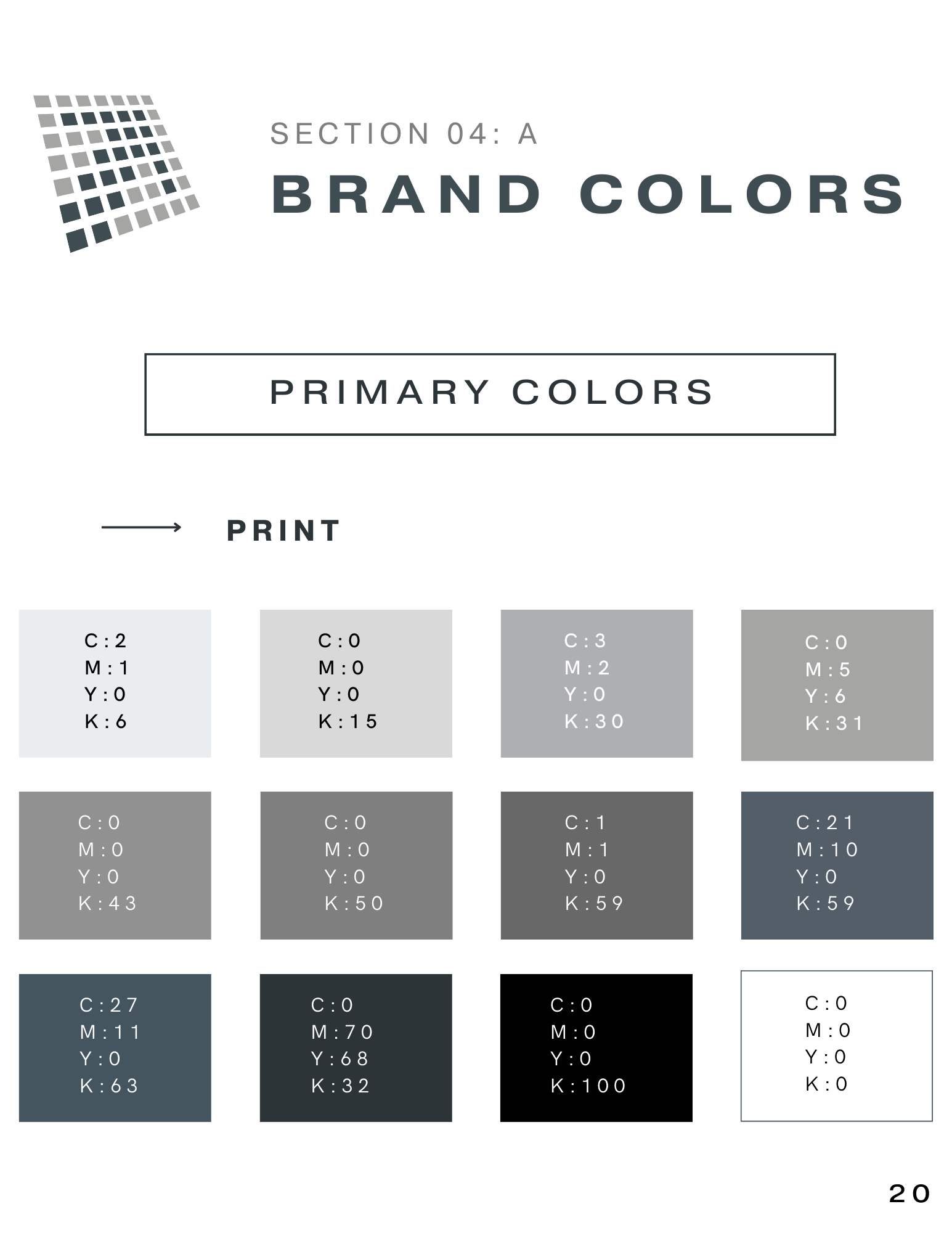
As Gadge USA embarked on a journey of redefining its visual presence in the market, the creation of a definitive Brand Style Guide became imperative. This guide was designed to act as a blueprint, detailing every facet of the brand's aesthetic—from color palettes and typography to logo usage and imagery guidelines. The objective was not just to provide a reference for internal teams but to cement the brand's modernized identity, making certain that every visual representation of Gadge USA, regardless of platform or medium, resonates with the same ethos and aesthetic consistency.
objectives
-
Develop a guide that ensures brand elements are consistently applied, promoting instant brand recognition and trustworthiness.
-
Infuse the guide with modern design principles, reflecting Gadge USA’s commitment to innovation within the packaging industry.
-
Ensure the guide is intuitive and easy to follow for all team members, regardless of their design background.
process
-
Immersed deeply into Gadge USA's existing branding materials and collateral to identify core elements that needed preservation and emphasis.
-
Systematically broke down the brand into its core elements: colors, typography, imagery, logo usage, and more, setting the structure for the guide.
-
Updated certain elements to align with contemporary design trends while maintaining the core essence of Gadge USA.
outcome
The brand style guide has now become the gold standard reference for all of Gadge USA's branding efforts. It has not only strengthened internal alignment on the brand's visual identity but has also elevated external communications, ensuring every touchpoint echoes the company's ethos with clarity and consistency.
reflection
Creating the style guide for Gadge USA was a journey of understanding and distillation. It emphasized the importance of having a single, unified source of truth for a brand's visual identity. The challenge of modernizing while preserving was a rewarding experience, highlighting the delicate balance between evolution and legacy in branding.


